The Safe Area: Not all screens are created equal

In the age of edge to edge display, it’s time we all found a safe space. Last year’s launch of the iPhone X introduced edge to edge display, removing the button and any non-display area from the front of the device. The new model came with larger screen size and with it, introduced a new aspect ratio, different than that of previous iPhones. This evolution has subsequently required the need for a ‘safe area’, a space where all images and important messaging get placed to avoid being cut off. This blog will demonstrate the importance of using the ‘safe area’ to protect your brand and provide a smooth user experience.
What is the ‘safe area’?
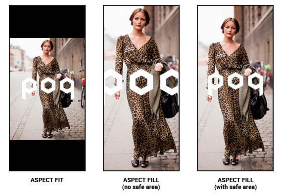
The ‘safe area’ is a specifically measured section of the iPhone screen where important imagery, logos or call to action are placed to be properly displayed on both older and newer versions of the iPhone. For many retailers, the brand is everything and ensuring their brand and its image associations are optimally visible is of the utmost importance. Thus, when you produce splash screens or app stories with the ‘safe area’ in mind, brand imagery will be perfectly displayed. Without the ‘safe area’ brand imagery (e.g. logos) will be compromised. Below is an example of attempting to take an iPhone 8 image and fit it on an iPhone X with aspect fit, aspect fill and aspect fill with the proper ‘safe area’ margins:

Using the ‘safe area’?

To the left is an example of how to create an image with the proper ‘safe area’ that will work on both older and new iPhone models. The ‘safe area’ is measured with sufficient bleed areas to protect your important messaging or imagery from seeping off the screen. Using the ‘safe area’ for your splash screen will ensure your brand remains whole and the user is provided with a great first impression. |
Using the ‘safe area’ for app stories is also necessary for avoiding brand injuries due to important images or call to actions being caught in the bleed margins. Like its inspiration, Instagram, app stories have a persistent icon and tab bars at the top of the screen that keep users notified of the story they are within and how many cards are browsable. Should the image not follow ‘safe area’ measurements the image will not only be cut off but also obstructed by the built-in display design of the app stories.
It is important to have your app optimally designed to garner positive brand sentiment and a satisfying user experience. Using the ‘safe area’ will consistently ensure your brand is presented in the best light possible. With it, you will easily avoid damage by bleed areas. Think of the ‘safe area’ as the space untouchable by the storm circles of Fortnite or PUBG.


