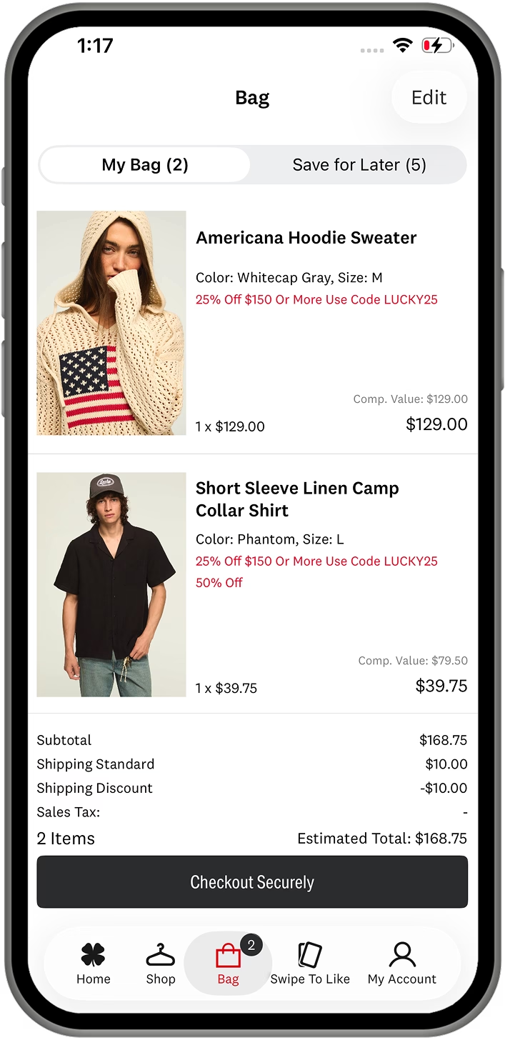


Poq Spring/Summer ’26 Release: Dynamic Content Everywhere, Speed and Autonomy for Your Team
Your merchandising and marketing teams move fast. Development cycles don’t always keep up. SS26 closes that gap. It takes Dynamic Content further into the app than ever before, giving your team the ability to build, schedule, and optimize content across more surfaces without waiting on a sprint.
SS26 brings a new way to build and schedule content in poqstudio, a bigger component library, and seven new/enhanced ecosystem partners connecting the platforms your retail operation already runs on natively into the app. Available from 30 July 2026.
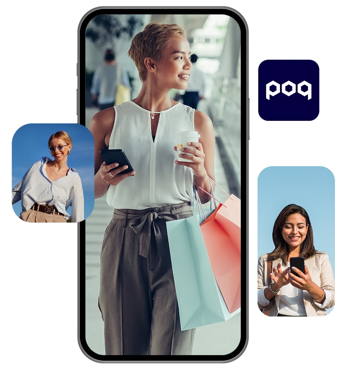
Dynamic Content Everywhere: New Placements, New Components
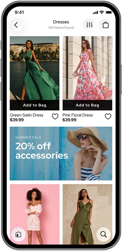
PLP Grid Slots let you place Dynamic Content directly between product cards on the Product Listing Page. Inject promotional banners, editorial features, or any component from the library, at whatever grid positions you choose. Two slot sizes are supported: full-width and item-sized. Slots can be configured differently per category, so Women’s and Men’s PLPs can serve different content with no custom code. Grid Slots help you turn PLPs into merchandising moments through campaign highlights, brand stories, and hero products, without pulling shoppers away from browsing.
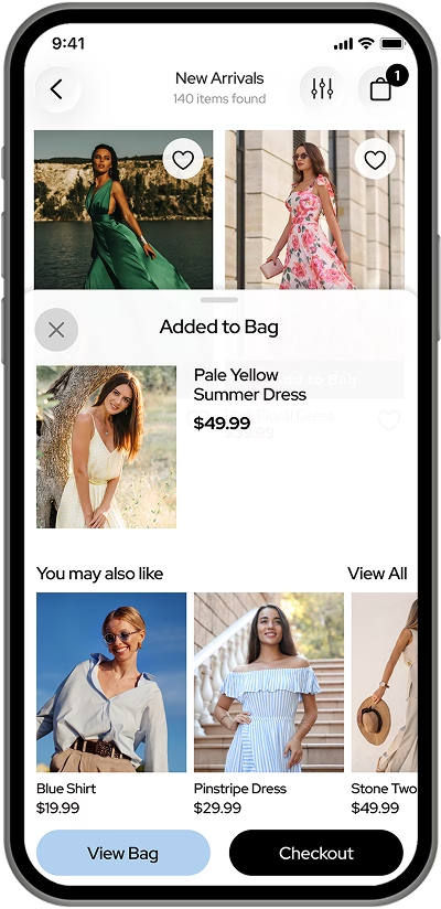
Add to Bag Content Panel. When a shopper adds a product to their bag, a configurable bottom sheet now slides up: confirmation of the added item, plus a Dynamic Content slot you populate however you choose, whether that’s with cross-sell carousels or promotional banners. It is one of the highest-intent moments in the shopping journey to influence basket value and conversion, and it’s now a surface your team controls.
On top of these placements, four additions to the Dynamic Content toolkit, usable in any screen or slot:
Wishlist Carousel: surfaces the shopper’s saved products wherever you place it, keeping wishlisted items visible and shortening the path from browsing to buying. Shown only when the wishlist has items in it.
UGC Carousel: user-generated content as a scrollable carousel, sourced by album, tag, or product from your connected UGC provider.
Icon Carousel: a scrollable row of icon tiles for category shortcuts, brand navigation, or quick links.
Tab Components: four tab styles (Pills, Switch, Underlined, and Segments), for organizing content-heavy screens with clear, branded navigation.

Screens: A New Way to Build and Schedule Content
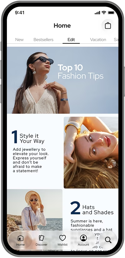
Screens gives your team a new way to build, preview, schedule, and organize Dynamic Content in poqstudio. Instead of working through Editions and Variations, your team creates and organizes content by the screen in which it appears, with a visual preview of exactly what will display for a given date, time, and set of user conditions.
The new Schedule Component completes the picture: define when content appears, with optional conditions, directly within a screen. Flash sale at midnight, seasonal editorial next week: plan it, schedule it, publish it, and see every active schedule at a glance.
Screens also makes it easier to manage Home with Dynamic Content. With page-level building, scheduling, and the full component library now in one place, there are now plenty of reasons to choose Dynamic Content over Banners.
Your Retail Stack, Connected
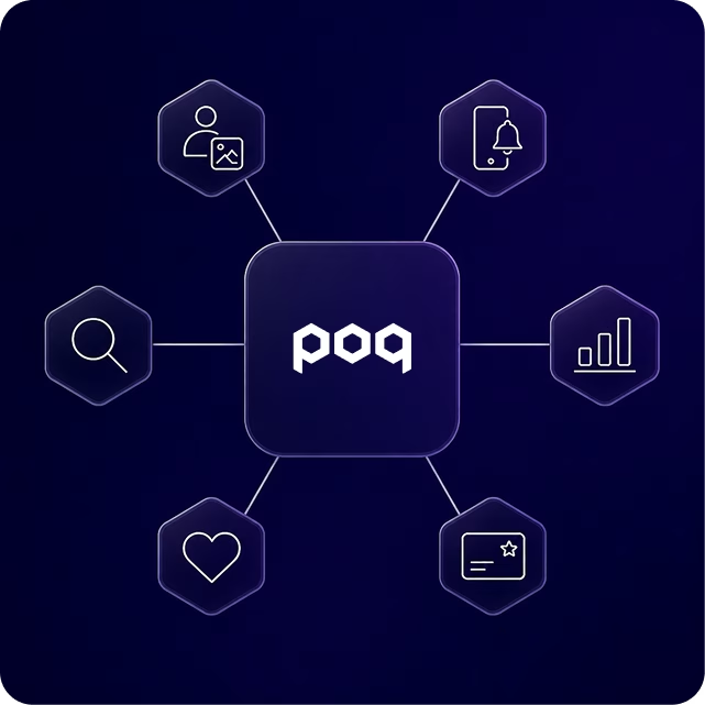
SS26 adds six new ecosystem integrations and a major enhancement to an existing one, bringing the platforms your retail operation already runs on natively into your app.
StoryStream: connect your shoppable UGC and social content feeds to the app through the UGC Carousel component, placing StoryStream content in any Dynamic Content screen or slot. Content can be filtered by stream, tag, or product, with per-app and per-locale configuration for retailers managing multiple markets.
Klaviyo: rich push notifications, in-app forms, and behavioral data flow to Klaviyo. If Klaviyo already runs your email and SMS, you can now seamlessly extend it into the app without operating a separate engagement stack.
Microsoft Clarity: free session recordings and heatmap analytics on iOS and Android, giving you a direct window into how shoppers use your app, including rage-tap and dead-tap insights. PII masking and consent-based tracking are built in.
Influence.io: connects your loyalty program to the app through poq’s loyalty framework. Shoppers can view their points balance, browse and redeem rewards, and complete earn activities, all in-app, with data binding available to build additional loyalty surfaces as your program grows.
Reviews.io: customer ratings and reviews on your PLP and PDP, with in-app submission so shoppers can leave feedback without leaving the app.
Swym Wishlist Plus: integrated native wishlist functionality, with guest wishlist support and guest-to-account sync built in.
Algolia (enhanced): our Algolia integration now adds predictive search and AI-driven recommendation carousels, with four models available: Related Products, Bought Together, Trending Items, and Looking Similar. Each is configurable in poqstudio via Dynamic Content data binding, with behavioral events feeding back to Algolia Insights automatically to improve ranking and personalization over time.
The Details That Add Up
Image Peek Animation: a subtle PLP animation that automatically reveals a product’s second image as cards come into view, driving discovery of additional imagery without any shopper interaction. Enabled by your delivery team via an app setting.
Category Manager v2 now supports both feed-based and feedless apps allowing API driven catalogs to be edited and amended directly in poqstudio. All categories are managed from a single interface, with status badges and a Category Edits history view so your team always knows what’s changed.
Android Compose migration: the Product Listing Page and carousel components on Android have been migrated to Jetpack Compose, bringing faster rendering and smoother animations.